Art

Fire

This piece is a meditation on the alchemical concept of fire. It makes a great 4K wallpaper!

This is abstract art showing a purple background with thickly outlined equilateral triangles arranged point-up as a Sierpinski gasket. The triangles appear in a range of saturated warm colors, and some of the smallest ones are filled with pale blue. Behind the triangles are corresponding circles in thin dashed outlines. In the center is a single triangle in an extra-thick pale blue outline, reminiscent of the alchemical symbol for fire.

Phoenix Comics & Games

These banners are one example of my visual branding work for the Seattle-based shop Phoenix Comics & Games.

Three tall banners each show the words “Phoenix Comics & Games” above a logo. The logo depicts a sun-like ring over which a geometric phoenix flies in side view. Each banner uses a different palette chosen from four colors: golden yellow, orange, dark red, and white.

Call it Cogstown

This is the front page of a fictional tabloid-format newspaper created as part of the tabletop roleplay campaign Destiny’s Calling.

In side view, a tall cluster of towers and bridges sits atop a rocky coast, all drawn in rough lines and irregular angles. Below is a cut-away view of a network of neat, brightly-lit caves and tunnels with more modern-looking buildings, all drawn in very clean and regular lines. The entire piece is colored in shades of grey and teal. Surrounding the illustration are the expected textual elements of such a newspaper, featuring “Call it Cogstown” as the headline.

Markerstone Soup 0999-08-07

Another newspaper created for Destiny’s Calling, this one features whimsical imagery and strange writing from a land of fae creatures.
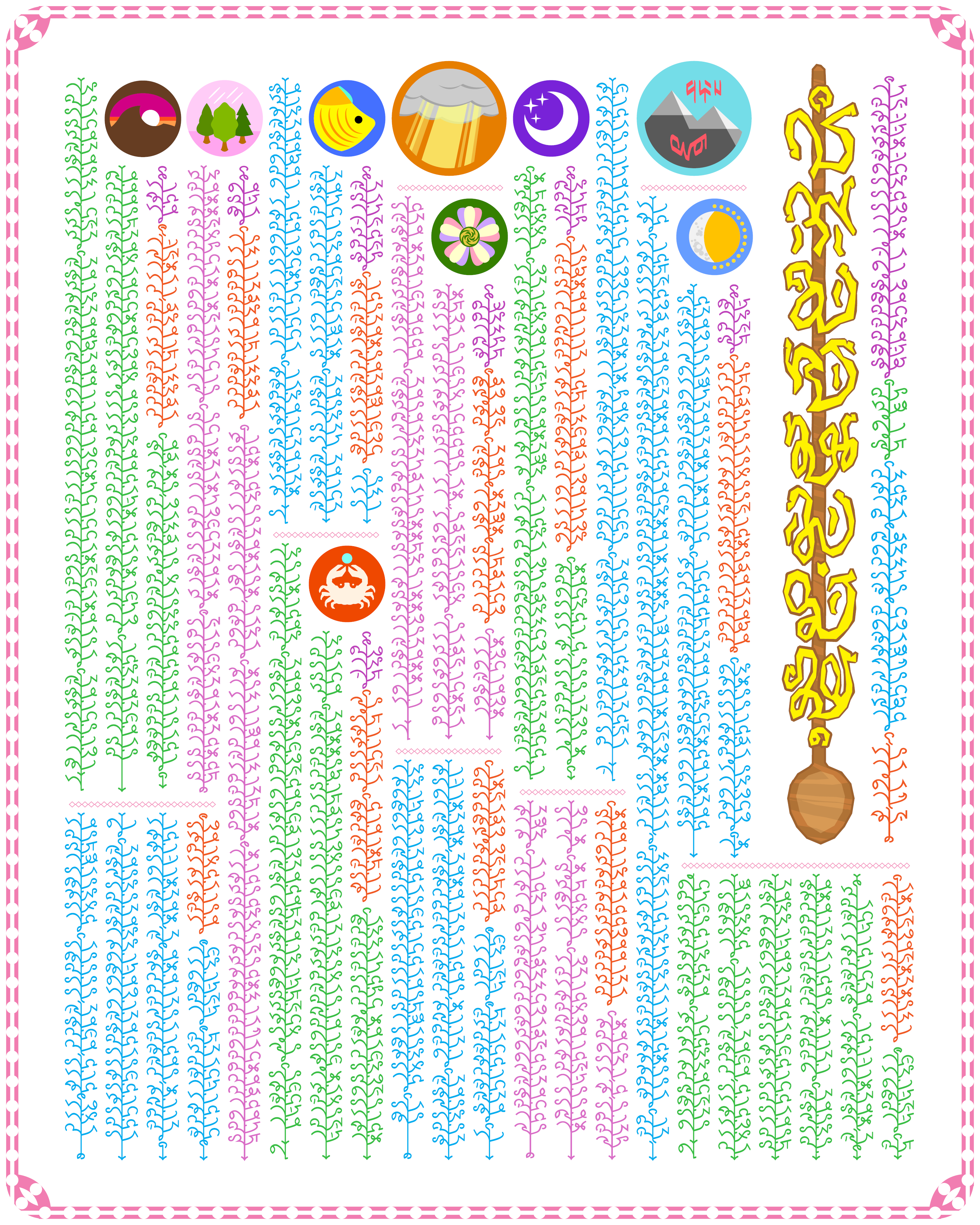
This is the front page of a fictional newpaper from a land of fae creatures. As such, every bit of it is brightly colored. This includes the text, shown in an invented vertically-oriented alphabet reminiscent of tangled sprigs coming off of vines. In contrast with the very clean-lined type, the banner has the paper’s name in scrawly letters set on top of the handle of a long wooden spoon. The start of each article features a circular seal representing the places involved; stylized mountain peaks with letters from two different alphabets, a combined sun and moon, a crescent moon with three stars, a grey cloud pierced with rays of sunlight, a flower with colorful petals, a crab holding a pearl, a colorful fish, three trees with raindrops above, and a mountain's silhouette at sunset.

As Above, So Below

This is a small sampling of cards from the As Above, So Below cartomancy deck.

On a wooden surface, five tarot-sized cards are arranged a little unevenly, slightly overlapping. Each shows a combined alchemical sigil in the center. Above and below four of the symbols, the alchemical processes represented are written in white type; all of this appears to glows slightly. All cards show a dark, starry background, and each is tinted to reflect the element involved.

Foolscap 2016 conbook cover

This is the front page of the 2016 conbook for Foolscap, a small convention for creatives, crafters, thinkers....

The top of this conbook cover shows a five-by-five grid of rectangles, circles, and shapes in between, with a gradient of colors between violet, cyan, and gold. In the center of each is a different line-art icon in white. Below that, the convention's name, “Foolscap”, is shown in large tapered sans-serif type with the top of the “F” resembling a jester's cap in the same color scheme. Below and to the right that is the year, 2016.