Fonts
All these fonts are released under a Creative Commons Attribution 3.0 license.
Vector fonts
The newest fonts are at the top. There’s also a package of all these fonts.
E-Keet Compression Mono
This font is a monospaced variant of E-Keet Compression, and is excellent for tight spaces that need columns to line up. It works best at multiples of 12 points.
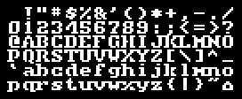
E-Keet Slipstream Regular
A stylized monospace font, this includes all the box drawing characters needed for a DOS-style terminal. It works best at multiples of 13 points.
E-Keet Slipstream Bold
A counterpart to E-Keet Slipstream Regular, this features the same width and character set. It also works best at multiples of 13 points.
E-Keet 50Hz
This monospaced font is designed specifically for use in modern music trackers – check out the pound sign! It works best at multiples of 12 points.
E-Keet Compression
This font was originally made for use on my Handspring Visor PDA in order to fit maximum text on a line. It works best at multiples of 12 points.
E-Keet Winterlate A26
“A26” stands for “Alphabet 26”, my favorite unicase variant. It works best at multiples of 10 points.
E-Keet Winterlate BC
“BC” stands for “bicameral”, having a distinct lowercase. It also works best at multiples of 10 points.
E-Keet Pixelwood
Not enough serifed raster-style fonts exist in the world. This one works best at multiples of 16 points.
E-Keet Paragon Black
This was created as a replacement for the titling font in the MMORPG City of Heroes.
E-Keet Beans
This started life as a monospaced raster font for Impulse Tracker.
E-Keet Altaica
This font was also designed for Impulse Tracker.
Bitmap-style fonts
There’s a package of all these TrueType fonts for general use. They all work best at multiples of 8 points.
These fonts were originally designed as bitmap fonts for the music creation programs Impulse Tracker and Schism Tracker which use characters of fixed 8×8 pixel size. Many of these are packaged with those programs! There is a bundle of ITF files for users of the aforementioned trackers who want the whole set shown (along with a couple bonuses).
EK-ALTAI
This narrow, stencil-like font has a more developed vector font shown above.

EK-ANGLE
Oblique letters go a long way toward breaking up a monospace grid.

EK-BEANS
This short, highly rounded font also has a more developed TrueType font above!

EK-BINGO
Exaggerated thickness makes for a fun diversion from the everyday grind.

EK-LOSS
This is an experiment to see how much can be removed from a letterform while leaving it distinct enough to be read.

EK-PIPED
Joints and pipes are partially the inspiration for this somewhat abstract font.

EK-PIPER
The above font is strengthened and made more readable with a thicker stroke.

EK-RACER
Inspiration struck from watching a friend play an old game with a similar font on the Atari 800.

EK-RIVET
Mechanical, serifed, modern, and somewhat steampunk – this is a personal favorite.
EK-SKOOL
Skoolhaus has a certain basic, geometric, childlike appeal.

EK-SLIDE
Instead of smaller, why not make the lowercase… lighter?

EK-SPACE
My very first Impulse Tracker font. Not exciting, but also not very distracting.

EK-SPELL
Making music… with a Speak&Spell? (Note: The track “Spell Machine” came first.)

EK-TEK
Space made angular, this is tied with Rivet for my frequency of use.

EK-TEMP
This broken serifed font, a mutation of Rivet, never got a better name.

EK-WINTR
Winterfresh is stark, square, and just chilly enough to be crisp. It provided some of the inspiration for the font “E-Keet Paragon Black” listed above.

Software used
- FontStruct to design glyphs.
- Adobe Illustrator to design glyphs.
- Notepad++ to convert Adobe SVG to Inkscape SVG.
- Inkscape to convert vectors to fonts.
- Impulse Tracker to design raster fonts.
- Pixel Font Converter to generate TrueType fonts from bitmaps.
- FontForge to edit font properties.