2023-03-13

All-new site! All-new art! Many new fonts and much new music! Thank you for visiting, and please don’t be afraid to get in touch if something seems broken, missing, or otherwise notable.


Art

Fire

This piece is a meditation on the alchemical concept of fire. It makes a great 4K wallpaper!

This is abstract art showing a purple background with thickly outlined equilateral triangles arranged point-up as a Sierpinski gasket. The triangles appear in a range of saturated warm colors, and some of the smallest ones are filled with pale blue. Behind the triangles are corresponding circles in thin dashed outlines. In the center is a single triangle in an extra-thick pale blue outline, reminiscent of the alchemical symbol for fire.

Phoenix Comics & Games

These banners are one example of my visual branding work for the Seattle-based shop Phoenix Comics & Games.

Three tall banners each show the words “Phoenix Comics & Games” above a logo. The logo depicts a sun-like ring over which a geometric phoenix flies in side view. Each banner uses a different palette chosen from four colors: golden yellow, orange, dark red, and white.

Call it Cogstown

This is the front page of a fictional tabloid-format newspaper created as part of the tabletop roleplay campaign Destiny’s Calling.

In side view, a tall cluster of towers and bridges sits atop a rocky coast, all drawn in rough lines and irregular angles. Below is a cut-away view of a network of neat, brightly-lit caves and tunnels with more modern-looking buildings, all drawn in very clean and regular lines. The entire piece is colored in shades of grey and teal. Surrounding the illustration are the expected textual elements of such a newspaper, featuring “Call it Cogstown” as the headline.

As Above, So Below

This is a small sampling of cards from the As Above, So Below cartomancy deck.

On a wooden surface, five tarot-sized cards are arranged a little unevenly, slightly overlapping. Each shows a combined alchemical sigil in the center. Above and below four of the symbols, the alchemical processes represented are written in white type; all of this appears to glows slightly. All cards show a dark, starry background, and each is tinted to reflect the element involved.

Albums

On the Game Grid    Download OGG    Download MP3

This album from 2004 is a collection of music that appeared in videogames or is videogame-related.

Cover artwork for the album On the Game Grid. A dark purple background shows a slightly lighter purple electronic-circuit-like pattern. At the center is a complicated design of concentric circular segments that form a disc. At its center, the Electric Keet logo appears three times following the sides of a hexagon. Above and below the disc, the names of the artist and album appear in rounded retro-tech type.

Frozen Hex    Download OGG    Download MP3

The “middle child” of the three earliest albums. These albums were released on CD-R discs. Many of these discs didn’t burn properly, rendering some of the tracks unplayable. Oops!

Cover artwork for the album Frozen Hex. It is a pale blue background with the name of the artist and album at the top left in blobby, dark blue type. The bottom right has a line art illustration of an anthropomorphic kangaroo posed dramatically with hands in motion, manipulating some fort of energy into a roughly hexagonal shape.

Beyond It All: version one point zero beta three    Download OGG    Download MP3

My first album from 1997, this enjoyed three distinct releases, each with minor adjustments to the music within.

Cover artwork for the album Beyond It All: version one point zero beta three. It is a white background with the Electric Keet logo at the center, the artist’s name above, and the album’s name below. All of these are black outlines; showing behind and around them are faint construction lines, some showing accurate angle and length measurements.

Vector fonts

E-Keet Winterlate A26

“A26” stands for “Alphabet 26”, my favorite unicase variant. It works best at multiples of 10 points.

E-Keet Winterlate BC

“BC” stands for “bicameral”, having a distinct lowercase. It also works best at multiples of 10 points.

E-Keet Pixelwood

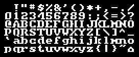
Not enough serifed raster-style fonts exist in the world. This one works best at multiples of 16 points.

E-Keet Paragon Black

This was created as a replacement for the titling font in the MMORPG City of Heroes.

E-Keet Beans

This started life as a monospaced raster font for Impulse Tracker.

E-Keet Altaica

This font was also designed for Impulse Tracker.


Raster fonts

EK-ALTAI

This narrow, stencil-like font has a more developed vector font shown above.

Full display of the 8×8 pixel font EK-ALTAI. It is a bold and somewhat condensed font, featuring gaps where connections can be implied.

EK-ANGLE

Oblique letters go a long way toward breaking up a monospace grid.

Full display of the 8×8 pixel font EK-ANGLE. This is a conventional sans-serif font with a strong slant.

EK-BEANS

This short, highly rounded font also has a more developed TrueType font above!

Full display of the 8×8 pixel font EK-BEANS. It is a thin and wide lowercase-only font, notable for its “uppercase” using lowercase forms in bold.

EK-BINGO

Exaggerated thickness makes for a fun diversion from the everyday grind.

Full display of the 8×8 pixel font EK-BINGO. This sans-serif font shows fat vertical strokes toward the left and thin ones to the right, giving it a friendly feel.

EK-LOSS

This is an experiment to see how much can be removed from a letterform while leaving it distinct enough to be read.

Full display of the 8×8 pixel font EK-LOSS. This is a tech-styled sans-serif font with forms that feature gaps and absent strokes.

EK-PIPED

Joints and pipes are partially the inspiration for this somewhat abstract font.

Full display of the 8×8 pixel font EK-PIPED. A thin-lined tech-styled sans-serif, this font features fragmented geometric letterforms.

EK-PIPER

The above font is strengthened and made more readable with a thicker stroke.

Full display of the 8×8 pixel font EK-PIPER. It is a stylized sans-serif font with both thick and thin strokes along with gaps where strokes can be implied.

EK-RACER

Inspiration struck from watching a friend play an old game with a similar font on the Atari 800.

Full display of the 8×8 pixel font EK-RACER. This blobby font features thicker strokes along left and bottom, giving it a playful feel.

EK-RIVET

Mechanical, serifed, modern, and somewhat steampunk – this is a personal favorite.

Full display of the 8×8 pixel font EK-RIVET. This is a geometric serifed font. The box-drawing characters have dots to imply rivets.

EK-SKOOL

Skoolhaus has a certain basic, geometric, childlike appeal.

Full display of the 8×8 pixel font EK-SKOOL. Reminiscent of handwriting lessons from childhood, this font has thin and strongly geometric strokes.

EK-SLIDE

Instead of smaller, why not make the lowercase… lighter?

Full display of the 8×8 pixel font EK-SLIDE. This all-caps sans-serif font is comparatively small, and the uppercase is bolder than the rest.

EK-SPACE

My very first Impulse Tracker font. Not exciting, but also not very distracting.

Full display of the 8×8 pixel font EK-SPACE. This is a straightforward sans-serif with a few rounded corners in the lowercase.

EK-SPELL

Making music… with a Speak&Spell? (Note: The track “Spell Machine” came first.)

Full display of the 8×8 pixel font EK-SPELL. This is an approximation of a sixteen-segment LED display, similar to those used in the original Speak&Spell toy.

EK-TEK

Space made angular, this is tied with Rivet for my frequency of use.

Full display of the 8×8 pixel font EK-TEK. This very tech-inspired font features beveled corners at the top-right and bottom-left.

EK-TEMP

This broken serifed font, a mutation of Rivet, never got a better name.

Full display of the 8×8 pixel font EK-TEMP. This thin-lined serifed font features geometric forms interrupted by gaps. It is effectively a lighter form of EK-RIVET.

EK-WINTR

Winterfresh is stark, square, and just chilly enough to be crisp. It provided some of the inspiration for the font “E-Keet Paragon Black” listed above.

Full display of the 8×8 pixel font EK-WINTR. This is a slightly small, aggressively rectilinear font with dense, bold strokes.